vitae 22

A complete redesign of the Vitae 22 app to allow a better user experience, an easier flow and a cleaner, lucid interface design.
Project Overview
The idea of this project was to redesign an app that could be used alongside the products to provide a complete home IoT solution and improve consumer experience. I was responsible for the complete design and planning of the app interface.
Objective
1. Creating a more user-friendly app with a more guided flow.
2. Making the interface both visually appealing and consumer-friendly.
3. Helping the user to navigate better and easier by reducing technical jargon and increasing visual clues.
Challenges faced:

1. Making an easier-to-use interface
The current interface was difficult to use, confusing, and with a complicated flow. It was needed to make it easier to use and with clearer instructions and directions.
2. Increasing the visual appeal
The app needed to be more visually appealing and eye-catching, yet with a simpler use. The main purpose of this was not to just make it better to look at, but to have enough breathing space and clearer graphics to make it easier for the consumer to know exactly what to do next.
3. Reducing data overload
The current app was a clear contradiction of the Hicks' law; there was just too much information on screen which made it confusing to use. It was needed to only have essentials on screen, a clear call-to-action, and for the user to understand exactly what the main objective of that screen is.
Tools Used
Figma
Adobe Illustrator
the process
Research
My first step was to research about the IoT app competitors in the market, paying more focus to the ones based in India.

INSIGHTS:
1. The research helped me figure out the changes for the new design.
2. I understood the basic layout and framework that would work for a smooth functioning, and the escalated need of a good workflow.
3. I was also able to understand the gaps between different products and fill them in our app.
User Journey and Information Architecture
Using the insights I gathered from my research and other team members, I began adding changes to user flows and improve the user experience. Below is the user flow of the entire app. The teal sections represent the main navigation of the app.​​​​​​​
the design
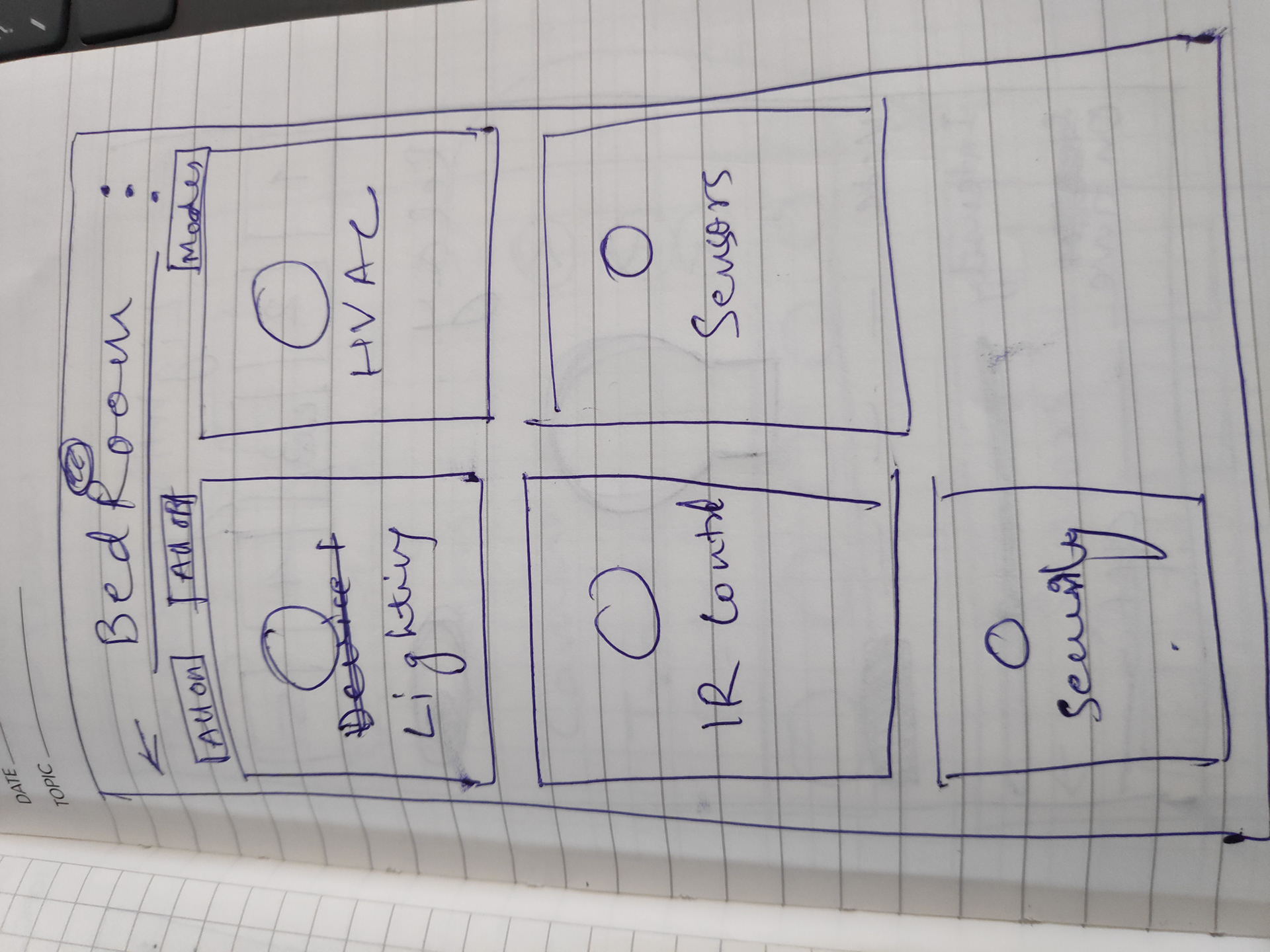
Eary Sketches and Wireframes
I started with quick, rough sketches of different ideas, trying to fill the gaps and focusing on a better user experience.
We had a list of screens to cover all scenarios and then we started to do grayscale wireframes to detail out the flows. In this step I also involved the developers to discuss about dos and don’ts.
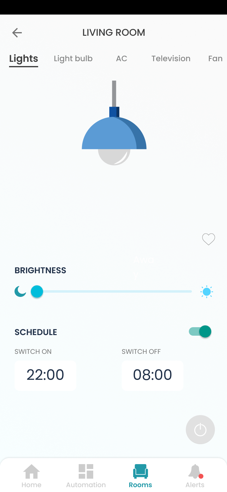
Design Style Guide and Final Designs
To improve the team performance, user experience and team efficiency, I decided to start build the Design style guide which helps to be fast when iterating on designs.
This foundation loosely defined our typography, colors, icons , buttons, spacing, navigation and many more.Main font used: Poppins Main colours used: Teal, white, black.