Tools Used
Figma
Adobe XD
Adobe Illustrator
Challenges Faced
1. Increasing data visibility across the web interface
2. Keeping the interface simple and easy to use, despite the large amount of content present.
3. Make the design responsive across devices, but focus mainly on larger screens.
4. Make the experience of getting a service as simple as ordering a product online.
5. Keeping the legal jargon to minimum as the main user group would be people from non-legal backgrounds.
the process
Multiple meetings and understanding requirements
The first step of any project is to understand the requirements of the client, with clear communication, and preparing a list of all requirements. The proposal and scope of the project is discussed and is shared among all involved in the project. An RPF document is prepared and shared. Also, the client gets familiar with who would be responsible for what role in the project and how the process is going to be.
User Flow
There were five user personas in the project, namely:
1. The Client, or the consumer at whom the products are aimed
2. The Lawyer, who would be working as an employee of OALP team, and handling the cases
3. The Admin, who would have most functionality and access to the entirety of the project
4. The Finance, who handled the financial aspect of the process
5. Customer Support, who were responsible for providing service and answering queries of the clients
We prepared user flows, which outlined the functionalities and processes expected of each user's behaviour.
View All User StoriesAdmin User story

Information Architecture
A sitemap and information architecture is crucial in the designing of a complex, multi-functionary app. With the large number of functionalities to be incorporated for each of the personas, it was vital to understand the primary and secondary of each of the users. This also helped in categorization and organization of the the functionalities that were otherwise in one large heap so far.
View Information Architecture Charts and SitemapWireframes
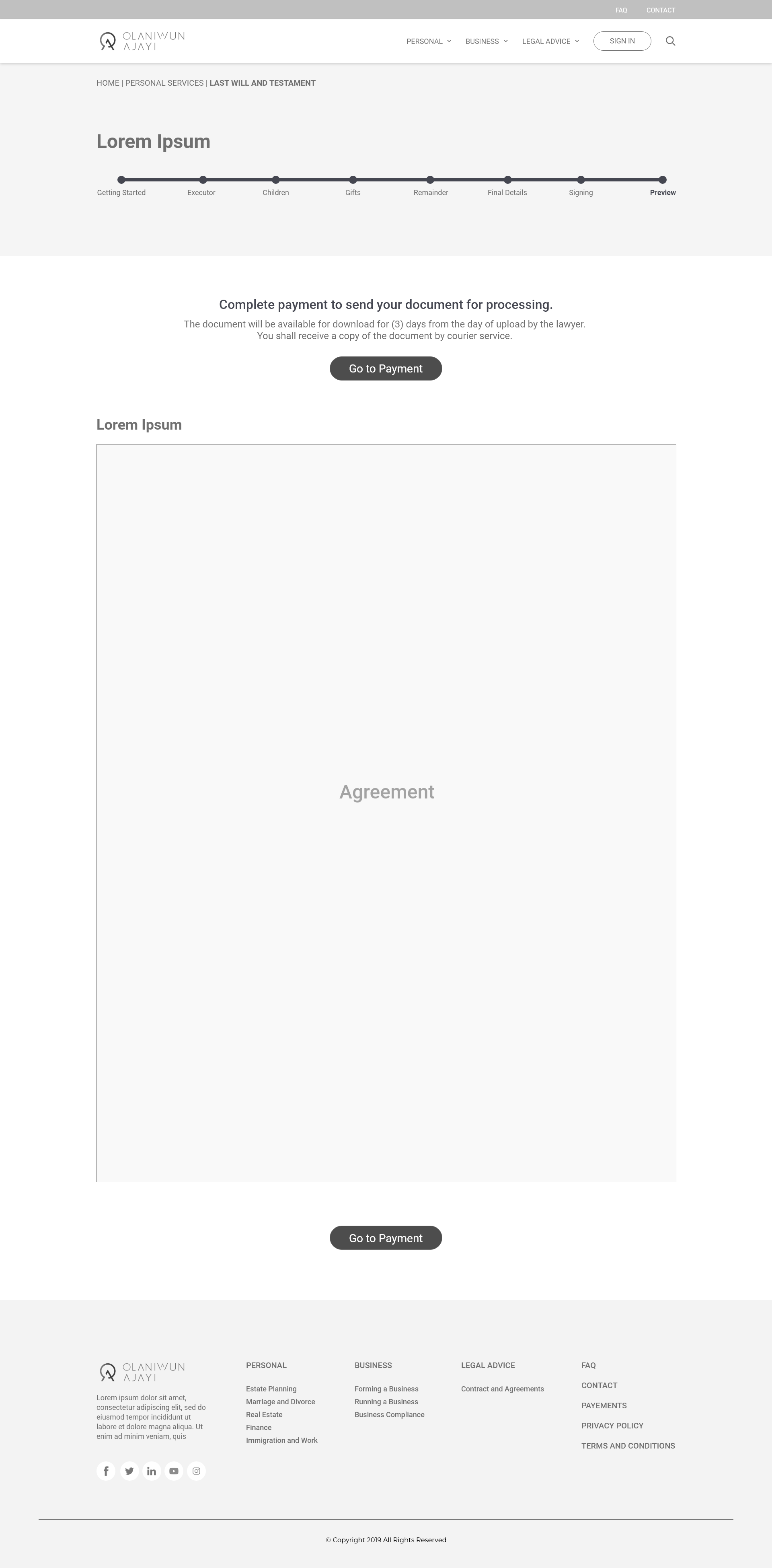
Based on the information architecture and sitemap (which required multiple revisions), I started the wireframes of the project. The wireframes were needed for each personas, general screens, chat bot, etc. It was important to concentrate on the functionalities and make the user flow as simple as possible.
View All WireframesUI Designs
After alterations of wireframes as per client feedbacks and internal discussions, they were finalized and we began with UI designs. This included development of a design style and design components. We decided to proceed with the following:
1. Pairing of font families Lato (serif) for headings and Raleway (sans-serif) for content and paragraph
2. Cohering with the present brand colours of shades of blue, with an orange accent for highlights and buttons
3. Rectangular elements and edges for authentic and official feel of legal organization
View All UI DesignsUI Design Guide

Collaboration and Design Handover
Designs are meaningless till they are converted into functional codes. LaniDigital was developed by our team of developers. For handing over the design, we used Adobe XD development links. The design needed several revisions in the process of developemnt. Altogether, it was an organic process and the cycle of revisions, iterations and designing was done multiple times.